Webyx for Gutenberg

Webyx for Gutenberg
Webyx for Gutenberg

Introduction

Welcome in Webyx for Gutenberg, a Webineer project: we are happy and honored with your presence!

This idea was born with the aim of creating amazing fullscreen websites in WordPress with the modular approach of the Gutenberg editor.

We wanted to simplify and speed up the creating process, enabling customizations on the fly and making it as user friendly as possible.

300+ configurable options!

Webyx is an amazing WordPress project, a whole framework with more than 300 options that allows you to create websites and pages exactly as you want, giving your visitors the best full page full screen scrolling sliding snapping exprerience you can find on the web.

Be amazed by your imagination!

The Webineer team

What you can do

Webyx for Gutenberg is a plugin for WordPress that allows you to create amazing fullscreen scrollable websites quickly and easily. webyx for Gutenberg icon

The Free version allows you to fully create your website and add effects to customize it according to your needs without writing a line of code.

The Premium version further enhances Webyx for Gutenberg's power giving most demanding users more tools to help them improve their work and accomplish their ideas.

NOTE: whenever you will find options written in green in this guide, it means that they will be present in both the Free and Pro versions.
whenever you will find options written in purple in this guide, it means that they will only be present in the Pro version.
IMPORTANT: it is not possible to directly upgrade from the FREE version to the PRO version, they are two different products and not one the extension of the other. If you are using the FREE version and have created something with it, you will have to redo them again in the PRO version.

Some of the Free features:

Some of the Premium features:

Other features:

  • Built-in responsive Webyx menu
  • Responsive
  • Touch support
  • Clean and minimized code
  • Compatible with all modern browsers
  • No jQuery
  • Easy to use with hundreds of configurable options

Installation

Installing Webyx for Gutenberg is very easy:

1. Install using the WordPress built-in Plugin installer, or Extract the zip file and drop the contents in the wp-content/plugins/ directory of your WordPress installation.

2. Activate the plugin through the Plugins menu in WordPress.

From now on you will be able to access and use Webyx for Gutenberg!

Sometimes with the update of Gutenberg, WordPress or other third party plugins, Webyx for Gutenberg block might generate this error: "Webyx for Gutenberg block contains unexpected or invalid content".
If you see this error instead of the Webyx for Gutenberg block use "attempt block recovery" button.
Do not use "Convert to classic block" option.
We may introduce major changes that fix bugs or simply add new features which could lead to an attempt block recovery. Check your pages after each update

webyx for Gutenberg alignment

Uninstalling

To uninstall Webyx for Gutenberg you just need to:

1. Deactivate the plugin via the Plugins menu in WordPress.

2. Choose the Delete plugin action you can find in the same menu.

Quick user's guide

Learn how to use Webyx for Gutenberg to design your WordPress website and create pages quickly.

Webyx Plugin Settings

To customize general plugin settings just go to Settings > Webyx Plugin Settings.

  • Webyx licenses: enter your activation key here in order to use the Webyx for Gutenberg Pro version.
  • Hide WP admin top bar: hide WordPress admin top bar in Webyx pages preview.
  • Enable Webyx menu: enable Webyx menu "Display location" in Appearance/Menus/Menu structure/Menu Settings.
  • Version manager: you can browse the list of available previous versions of the plugin.
  • Maintenance and support: you can directly send an email to receive support from the developer team.

Webyx License

In order to take full advantage of the power of Webyx for Gutenberg Pro you need to activate a Pro license: just go to Settings > Webyx FGP Settings > Webyx license.

1. Insert the license key in the product license field.

2. Click the Active Product button.

webyx for Gutenberg license

To deactivate Pro license: just go to Settings > Webyx FGP Settings > Webyx license.

1. Click the Deactive Product button.

webyx for Gutenberg deactive

IMPORTANT: the license key was sent to you on the purchase confirmation email. In order to register Webyx FGP plugin for another domain you'll have deactive your license for current domain.
You can deactivate and reactivate your activation key any time you want as long as your product license is active. In installations where the product is deactivated it will no longer be usable.
WARNING: if the product license has expired, deactivating the activation key will no longer allow its reactivation. You will need to purchase a new product license.

Version Manager

To downgrade to a previous version, simply select it from those listed in the select Available versions and click on the Rollback Version button.

It is recommended to always use the latest version available, but you can use a previous one if it is necessary. Only use this feature carefully if you really need to go back to a previous version. Before rolling back make sure to backup your database and your WordPress installation files. To undo this operation, simply click on the cancel button. webyx for Elementor Version Manager

Content from Free to Pro version

After having installed the PRO version you can convert your content directly from the FREE version to the PRO version.

Before converting, please take a database backup as a precaution.

IMPORTANT: this process is irreversible.
webyx free to pro version

Automatic updates management

Updates are managed through the native interface provided by WordPress in Plugins.

It is recommended to always use the latest version available. Before updating, please take a database backup as a precaution.

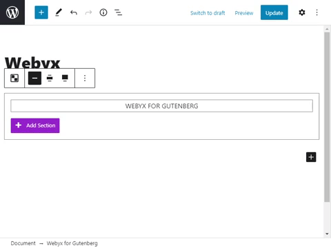
How to add the block in Gutenberg

To add Webyx for Gutenberg to the Gutenberg editor, follow these steps:

1. Create a new page or go to the page you would like to add the block.

2. Enable Webyx template page or Custom template page

3. Find Webyx for Gutenberg block on the Gutenberg blocks and add it to the page. webyx for Gutenberg add block

IMPORTANT: you can add only one Webyx for Gutenberg block. You should not add any other block to the page at the same level of the Webyx for Gutenberg block.

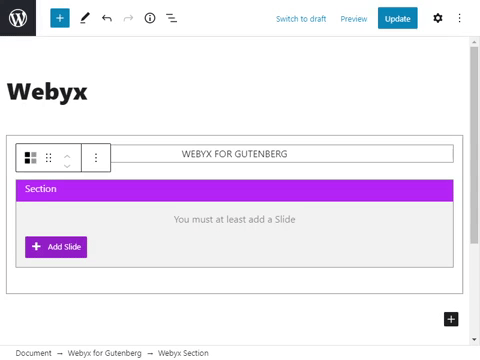
4. Inside the root level Webyx for Gutenberg block you must only add Section blocks that will contain exclusively Slide blocks.

IMPORTANT: remember to give different titles to Sections and Slides inside the same Section to allow a correct functioning of Navigation Bullets.

5. Create your layout inside every single Slide.

Enable Webyx template page

To enable Webyx template page, follow these steps:

1. Click on the Page tab in the right side of Gutenberg editor.

2. In Page find the Template select and choose webyx if you are using the free version, otherwise select webyx Pro if you are using the pro version.

NOTES: The Webyx for Gutenberg Pro can also be installed together with the free version, but it is not recommended for correct operation. Remember that there must be only one of the two on the page.
webyx for Gutenberg template

3. In Appearance > Menus create your new menu and enable in Menu Settings > Display location: Webyx Menu.

NOTES: Webyx for Gutenberg template provides a responsive, scrollable, multi-level, with logo custom menu (Webyx Menu) that could be created with the WordPress Menus internal management. Webyx Menu is compatible only to the Twenty(s) standard WordPress themes.

Template design

To enable a custom template page, follow these steps:

1. In Template Design enable the option Custom Template and put the page template path you want to use.

You can provide your own custom template, such as a modified version of the theme template. Put the template path here if you want to use your own. If left empty or if you write something that doesn't exist or it is wrong, the empty predefined page template will be used.

2. Remember that you should know and use some code to adjust a custom template (PHP, CSS, JS). It is a good practice to create a child theme where to possibly add these changes.

NOTE: use this option if you want to create a custom layout that includes elements not managed by Webyx such as user headers or footers.
webyx for Gutenberg template design

Webyx for Gutenberg navbar block utilities

You can change the Webyx for Gutenberg block size in the editor via preset options in its navbar. Default block width has a max-width of 610px.

  • Expand: wider than default (max-width 1240px).
  • Contract: default block width (max-width 610px).

webyx for Gutenberg alignment

Sections

Sections are containers that can have Slides only.

General actions on Sections

  • Add Section: click on Add Section button inside the Webyx for Gutenberg block.webyx for Gutenberg add section
  • Remove Section: click on the More Options menu dots in the top navbar and click Remove Block.
  • Add Slide: click on Add Slide button inside the Section block.webyx for Gutenberg add slide

Section navbar utility

You can choose options from the top Section navbar:

  • Expand/Contract: expand/contract selected Section in the editor for ease of use. webyx for Gutenberg expand or contract section content
  • Visible/Hidden: makes visible/hidden selected Section in the actual website page. webyx for Gutenberg visible or hidden section content
NOTES: These unique Gutenberg editor display settings in WordPress are saved to improve the user experience when creating pages.

Section general options

  • Name: insert here a name for the current Section.
    IMPORTANT: you should give different names for each Section otherwise some features may have problems (e.g. menu, bullets, etc.)
  • Tag type: select HTML tag type. This parameter changes the Section HTML tag to the specified tag.
  • Continuous horizontal: enables direct horizontal passage from first to last Slide of the same Section and vice versa.
  • Horizontal scrolling: the Section content navigation method change from vertical to horizontal scrolling (right to left and vice versa) to reveal content from the sides of the viewport. With this option all following Slides are put inside a unique Slide and positioned side by side one with the other.
    WARNING: horizontal scrolling option is not compatible with the normal scrolling website option.

webyx for Gutenberg section attribute

Editor settings for each Section

  • Header colour in editor: choose the Section header colour to be applied from the colour box.
  • Header title: shows the title in the current Section editor header block.
  • Header icons: shows icons in the current Section editor header block.
  • Header tag name: shows tag name in the current Section editor header block.
  • Header inner Slides counter: shows inner Slide counter in the current Section editor header block.

webyx for Gutenberg section editor settings

Slides

Slides are elements inside Sections that can have any type of content.

General actions on Slides

  • Add Slide: click on Add Slide button inside the Section block.
  • Remove Slide: click on the More Options menu dots in the top navbar and click Remove Block.
  • Add Slide content: click inside the Slide block and add Gutenberg blocks inside it. You can add anything inside here.

Slide navbar utility

You can choose options from the top Slide navbar:

  • Hide background: hides Slide background (image or colour you have eventually chosen from the Slide background options group) only in the editor. webyx for Gutenberg hide show background
  • Expand/Contract: expand/contract selected Slide in the editor for ease of use. webyx for Gutenberg expand or contract slide content
  • Visible/Hidden: makes visible/hidden selected Slide in the actual website page. webyx for Gutenberg visible or hidden slide content
NOTES: these unique Gutenberg editor display settings in WordPress are saved to improve the user experience when creating pages.

Slide general options

  • Name: insert here a name for the current Slide.
    IMPORTANT: you should give different names for each Slide. (Please note that Slides within the same Section should be named differently, while between different Sections they could also have the same name).
  • Anchor name: insert here a name for anchor (e.g: my-anchor-name). If an anchor name is not set, the number pattern {section}-{slide} will be used instead (e.g. 1-1, 1-2).
    IMPORTANT: you should give different anchor names (white spaces will be replaced with "-") for each Slide otherwise some features may have problems. Remember to enable the Anchors option in View Design tab.
  • Slide content: enable content position management in the current Slide.
  • Slide content position: select general content position in the current Slide (top, middle, bottom).
  • Tag type: select HTML tag type. This parameter changes the Slide HTML tag to the specified tag.
  • Media queries breakpoint width: enter a value that defines the threshold for switching from desktop to mobile mode in pixels (range from 0 to 5000 pixels with a step of 1).
  • Scrolling content: viewport exceeding Slide content will be displayed through scrolling.
  • Wrapper content: enable element wrapper for the Slide's content.
  • Wrapper Slide additional CSS class(es): you can add your own CSS class(es). Separate multiple classes with spaces.
  • Wrapper margin content: enable wrapper margin for the Slide content (top, right, bottom, left).
  • Wrapper padding content: enable wrapper padding for the Slide content (top, right, bottom, left).

webyx for Gutenberg slide attribute

webyx for Gutenberg slide attribute bottom

Slide background options

You can choose background options for every Slide. The options are configurable and independent for both desktop and mobile devices.

Background general options
  • Background: enable background general management.
  • Desktop background: enable desktop background management.
  • Mobile background: enable mobile background management.
  • Foreground Object: choose from a pre-estabilished set of foregrounds (colour, image, video).
    NOTES: through the Foreground Object it is possible to keep background settings set at the same time, guaranteeing the possibility of being able to switch from one to the other quickly. In the Free version, on the other hand, background image prevails over background colour.

    webyx for Gutenberg slide background general

Background colour

You can choose background colour for every Slide. The options are configurable and independent for both desktop and mobile devices.

  • Background colour: choose the background colour to be applied from the colour box.

webyx for Gutenberg slide background color

Background image

You can choose background image for every Slide. The options are configurable and independent for both desktop and mobile devices.

  • Background image: to choose the background image to be applied, click on the Upload Image button and select the image from media library.
  • Background image size: choose from a pre-estabilished set of sizes.
    • auto: background image is displayed in its original size.
    • cover: background image is resized to cover the entire container, even if it has to stretch the image or cut a little bit off one of the edges.
    • contain: background image is resized to make sure the image is fully visible.
  • Background image position: choose from a pre-estabilished set of positions. The first value is the horizontal position and the second value is the vertical (left-top, left-center, left-bottom, right-top, right-center, right-bottom, center-top, center-center, center-bottom).
  • Background image repeat: choose if the background image should be repeated or not.
    • repeat: background image is repeated both vertically and horizontally and the last image will be clipped if it does not fit.
    • no repeat: background image is not repeated and will only be shown once.
  • Background image attachment: choose if the image scrolls with the rest of the Slide or is fixed.
    • scroll: background image will scroll with the Slide.
    • fixed: background image will not scroll with the Slide.

webyx for Gutenberg slide background image

Background video

You can choose background video for every Slide. The options are configurable and independent for both desktop and mobile devices.

  • Background video: to choose the background video to be applied, click on the Upload Video button and select the video from media library.
  • Background video poster image: to choose the background video poster image to be applied, click on the Upload Image button and select the image from media library.
  • Preload: specifies that the browser should or should not load the entire video when the page loads.
    • none: the browser should NOT load the video when the page loads (downloads 0 bytes of the file).
    • auto: the browser should load the entire video when the page loads (downloads the entire video, the most data intensive option).
    • metadata: the browser should load only metadata when the page loads (downloads a percentage of the video, typically 2-5% of the file, to get metadata as size, bitrate, etc from the video, as well as have a bit of the video ready for immediate playback. IF preload is not set, the default setting is metadata).
  • Controls: specifies that video controls should be displayed.
  • Muted: specifies that the audio output of the video should be muted.
  • Autoplay: video will be played as soon as it's playable.
    IMPORTANT: you must activate muted option to let your video start playing automatically (but muted).
  • Loop: specifies that the video will start over again, every time it is finished.

webyx for Gutenberg slide background video

Editor settings for each Slide

You can choose editor settings for every Slide.

  • Header colour in editor: choose the Slide header colour to be applied from the colour box.
  • Header title: shows the title in the current Slide editor header block.
  • Header icons: shows icons in the current Slide editor header block.
  • Header tag name: shows tag name in the current Slide editor header block.

webyx for Gutenberg slide background video

View design

In this group you can customize the general type and behaviour of Webyx view for the website. The options are configurable and independent for both desktop and mobile devices.

  • View type: choose from a pre-estabilished set of Webyx view behaviour types.
    • full page: classic full height and width choice throughout the website.
    • full width with WEBYX header: the view has a partial height and full width with the addition of a WEBYX top header.
    • custom: allows the user to manually shape the view appearance to their liking.
  • Anchors: enable anchors navigation (#). Webyx will handle the website URL and browsing history.
    NOTE: you should give different anchor names (white spaces will be replaced with "-" automatically) for each Slide. If an anchor name is not set, the number pattern {section}-{slide} will be used instead (e.g. 1-1, 1-2).
    NOTE: if horizontal scrolling style is enabled, its anchor will refer to the first Slide of its row only.

webyx for Gutenberg view design

Webyx full page view

With this type of view the website will be structured in full screen: each Slide added within each Section will be automatically and suitably created to have full height and width dimensions of the viewport.

Webyx full width view with Webyx header

With this type of view the website will be structured in full width but with a partial height because a Webyx header will be added on top (this header is generated by WEBYX and not that of your page template or theme). The user will be able to customize the header, add a logo and a built-in menu if they wish so.

  • Webyx header type: choose if you want to have a header with a menu management for a single or multi page type of website.
    • Header single page (Webyx menu): provides a header with an internal navigation menu in Single Page mode, automatically generated by the block based on the number of Sections and Slides that make up the website.
    • Header multi page (WordPress menu): provides a header with a WordPress navigation menu in Multi Page mode, managed directly in "Display location" in Appearance/Menus/Menu structure/Menu settings.
    NOTES: the Single Page and Multi Page header configuration parameters are completely separate: both maintain their configuration settings independently from the other.
  • Header single page css class(es): add additional CSS class(es). Separate multiple classes with spaces.
  • Header view breakpoint: enter a value that defines the threshold for switching from desktop to mobile mode in pixels (range from 1 to 5000 pixels with a step of 1).
  • Header height: enter a value to apply a height in pixels (range from 0 to 5000 pixels with a step of 1).
  • Header background colour: choose the background colour for the header to be applied from the colour box.
  • Logo image: to choose the logo image to be applied, click on the Upload Logo Image button and select the image from media library.
  • Logo height: enter a value to apply a height in pixels (range from 0 to 5000 pixels with a step of 1).
  • Logo width: enter a value to apply a width in pixels (range from 0 to 5000 pixels with a step of 1).
  • Logo horizontal position: choose from a pre-estabilished set of positions (left, right).
  • Logo left position value: enter a value to apply a left position in pixels (range from 0 to 5000 pixels with a step of 1).
  • Logo right position value: enter a value to apply a right position in pixels (range from 0 to 5000 pixels with a step of 1).
  • Logo vertical position: choose from a pre-estabilished set of positions (top, bottom).
  • Logo top position value: enter a value to apply a top position in pixels (range from 0 to 5000 pixels with a step of 1).
  • Logo bottom position value: enter a value to apply a bottom position in pixels (range from 0 to 5000 pixels with a step of 1).
  • Menu horizontal position: choose from a pre-estabilished set of positions (left, center, right).
  • Menu margins: enable a margin for the navigation menu.
  • Menu margin top/right/bottom/left: enter a value to apply a top/right/bottom/left margin in pixels (range from 0 to 5000 pixels with a step of 1).
  • Menu dropdown item width: enter a value to apply a dropdown item container width in pixels (range from 0 to 5000 pixels with a step of 1).
  • Menu item height: enter a value to apply a item height in pixels (range from 30 to 75 pixels with a step of 1).
  • Menu item font size: enter a value to apply a item font size in pixels (range from 12 to 32 pixels with a step of 1).
  • Menu item background colour: choose the background colour for the menu items to be applied from the colour box.
  • Menu item background colour light: choose the background colour for the menu items when not mouse hovered to be applied from the colour box.
  • Menu item colour: choose the colour for the menu items to be applied from the colour box.
  • Menu item colour light: choose the colour for the menu items when not mouse hovered to be applied from the colour box.
  • Menu burger icon background colour (mobile only): choose the background colour for the burger menu icon background to be applied from the colour box.
  • Menu burger icon bars colour (mobile only): choose the colour for the burger menu icon bars to be applied from the colour box.
  • Menu overlay background colour (mobile only): choose the background colour for the menu overlay to be applied from the colour box.

Webyx custom view

It will be possible to shape Webyx view as needed for the website. The user will be in charge to create any necessary boundary structures and fillings.

  • Partialization hide scrollbar: hide browser's default scrollbar when it should be present in the Webyx view.
  • Partialization view breakpoint: enter a value that defines the threshold for switching from desktop to mobile mode in pixels (range from 1 to 5000 pixels with a step of 1).
  • Partialization view position: choose from a pre-estabilished set of types of positioning methods.
    • static: default value. Elements render in order, as they appear in the document flow.
    • relative: the element is positioned relative to its normal position.
    • absolute: the element is positioned relative to its first positioned (not static) ancestor element.
    IMPORTANT: if you decide NOT to use 'px' as unit of measure, remember to put the Webyx view inside a container with fixed measures. If you are using a custom template the Webyx view will take the width of the margins of your theme.
  • Partialization view width: set a value to apply a width (px, %, vw, vh).
  • Partialization view height: set a value to apply a height (px, %, vw, vh).
  • Partialization view margin: enable a margin for the partialization view.
  • Partialization view margin auto: enable an auto margin for the partialization view (only top and bottom margins will be settable).
  • Partialization view margin top: set a value to apply a top margin (px, %, vw, vh).
  • Partialization view margin right: set a value to apply a right margin (px, %, vw, vh).
  • Partialization view margin bottom: set a value to apply a bottom margin (px, %, vw, vh).
  • Partialization view margin left: set a value to apply a left margin (px, %, vw, vh).
  • View CSS ID: add your custom CSS ID to the view.
  • View CSS class(es): add additional CSS class(es) to the view.

Navigation Easings

In this group you can set the motion animation behavior for Slides, such as:

  • Vertical speed: set the vertical animation speed from a pre-estabilished set of values (range from 300 to 1200 milliseconds with a step of 1).
  • Vertical easing: set the vertical animation easing from a pre-estabilished set of curve types (5 types available).
  • Vertical easing PRO: set the vertical animation easing from a pre-estabilished set of curve types (31 types available).
  • Horizontal speed: set the horizontal animation speed from a pre-estabilished set of values (range from 300 to 1200 milliseconds with a step of 1).
  • Horizontal easing: set the horizontal animation easing from a pre-estabilished set of curve types (5 types available).
  • Horizontal easing PRO: set the horizontal animation easing from a pre-estabilished set of curve types (31 types available).

webyx for Gutenberg slide easing

Navigation Keyboard

In this group you can activate website navigation via keyboard.

  • Navigation keyboard: enables navigation between adjacent Slides via keyboard arrows.

webyx for Gutenberg keyboard navigation

Navigation Drag & Move (BETA)

In this group you can activate website navigation via drag and move on desktop mode.

  • Navigation drag and move: Allows to move between sections and slides by clicking and dragging the mouse on desktop mode.
  • NOTE: Use this option with "Force Desktop Mode" (Mobile Device tab options) if you want to navigate through arrows, bullets on mobile devices.

webyx for Gutenberg drag and move

Full Screen Button

In this group you can customize the look and behaviour of the full screen button.

  • Full screen button: enables a button to switch to full screen display.
  • Full screen button position: if full screen button is enabled it allows you to choose its position (right, left).
  • Full screen button dimension thickness: available set of thicknesses (thin, standard, thick).
  • Full screen button custom offset: enables custom positioning for the button (range from 0 to 5000 pixels with a step of 1).
    • Full screen button offset top
    • Full screen button offset right
  • Full screen button colour: choose the colour to be applied to full screen button from the colour box.
  • Full screen button background: enables button background.
  • Full screen button background colour: choose the colour to be applied to full screen button background area from the colour box.

webyx for Gutenberg fullscreen button

Mobile Devices

In this group you can set the motion animation behavior for Slides on mobile devices, such as:

  • Force desktop mode: enables Webyx desktop mode on all mobile devices.
    WARNING: if enabled, Sections and Slides navigation will be possible through arrows/bullets/menu and NOT through swipe/scroll.
  • Vertical speed: set the vertical animation speed from a pre-estabilished set of values (range from 300 to 1200 milliseconds with a step of 1).
  • Vertical easing: set the vertical animation easing from a pre-estabilished set of curve types (5 types available).
  • Vertical easing PRO: set the vertical animation easing from a pre-estabilished set of curve types (31 types available).
  • Vertical threshold: Threshold value in pixels for y-axis to fire vertical movement (select 10, 25, 50, 75 or 100).
  • Horizontal speed: set the horizontal animation speed from a pre-estabilished set of values (range from 300 to 1200 milliseconds with a step of 1).
  • Horizontal easing: set the horizontal animation easing from a pre-estabilished set of curve types (5 types available).
  • Horizontal easing PRO: set the horizontal animation easing from a pre-estabilished set of curve types (31 types available).
  • Horizontal threshold: threshold value in pixels for x-axis to fire horizontal movement (select 10, 25, 50, 75 or 100).
  • Horizontal swipe lock: disables side swipe on every Slide.
    WARNING: if enabled side Slides will not be reachable.
    webyx for Gutenberg mobile device
  • Horizontal scrolling gesture: set the horizontal scroll gesture for the Section that has the horizontal scrolling style enabled. (vertical, classic, all).
    NOTE: when this option is enabled the horizontal scrolling gesture selection will be forced to vertical (vertical scroll).
  • Horizontal scroll velocity: set the horizontal scrolling speed factor in mobile devices finger swiping gesture from a pre-estabilished set of values (range from 1 to 100 with a step of 1).

webyx for Gutenberg mobile device

Scrollbar

In this group you can customize the behavior of the browser's default scrollbar.

  • Hide scrollbar: hides browser's default scrollbar in the Slides when it should be present.
  • Scroll reset position: Scrolls back the content of the Slide with scroll bar when leaving it so it will always be at the start (for horizontal and vertical scrollable content).

webyx for Gutenberg loading splash screen

Background Audio

In this group you can activate and customize the behaviour of the background audio for the current website page. The options are configurable and independent for both desktop and mobile devices.

  • Background audio: enables background audio.
  • Audio player auto closing: enables auto closing of the audio player.
  • Audio player auto closing timer: enter a value that defines the audio player auto closing timer (range from 5 to 20 seconds with a step of 1).
  • Media queries breakpoint width: enter a value that defines the threshold for switching from desktop to mobile mode in pixels (range from 1 to 5000 pixels with a step of 1).
  • Background audio upload: to choose the background audio to be applied, click on the Upload Audio button and select the audio from media library.
  • Preload: specifies that the browser should or should not load the entire audio when the page loads.
    IMPORTANT: the preload attribute is ignored if autoplay is present.

    webyx for Gutenberg background audio

  • Controls: specifies that audio controls should be displayed.
  • Muted: specifies that the audio should be muted.
  • Autoplay: audio will be played as soon as it's playable.
    IMPORTANT: you must activate muted option to let your audio start playing automatically (but muted). NOTE: Chromium browsers do not allow autoplay in most cases.
  • Loop: specifies that the audio will start over again, every time it is finished.
  • Audio button icon: shows an audio player icon button.
  • Audio button size: available set of sizes (small, medium, large).

    webyx for Gutenberg background audio

  • Audio button background: available set of background types (color, image).
  • Audio button background colour: choose the colour to be applied to audio button background from the colour box.
  • Audio button background colour light: choose the colour to be applied to audio button background when not mouse hovered from the colour box.
  • Audio player horizontal position: if audio player is enabled it allows you to choose its horizontal position (right, left).
  • Horizontal position value: set a value to apply to the audio player horizontal position (px, %, vw).
  • Audio player vertical position: if audio player is enabled it allows you to choose its vertical position (top, bottom).
  • Vertical position value: set a value to apply to the audio player vertical position (px, %, vh).
  • Audio button background upload image: to choose the audio player button background image to be applied, click on the Upload Image button and select the image from media library.

    webyx for Gutenberg background audio

Loading Splash Screen

In this group you can customize the look of the loading splash screen.

  • Loading Splash Screen: enables loading splash screen.
  • Splash screen type: choose the splash screen type (default, custom).
  • Background colour: choose the colour to be applied to splash screen background from the colour box.
  • Spinner colour: choose the colour to be applied to the spinner from the colour box.
  • Initial loading message: message to be displayed during the website loading.
  • Message colour: choose the colour to be applied to initial message from the colour box.
  • Background image: to choose the background image to be applied, click on the Upload Image button and select the image from media library.
  • Enable time duration: enables a predefined time duration for the loading splash screen to be shown.
  • Always visible: the loading splash screen will be visible indefinitely.
  • Time duration: set the value for the time duration (range from 1 to 10 seconds with a step of 0.1).

webyx for Gutenberg loading splash screen

Custom CSS

In this group you can add your custom CSS rules.

  • Custom CSS: enables the Custom CSS button to open a pop-up window where you can enter your CSS code for the page.

webyx for Gutenberg custom css

Event Hooks

In this group you can add your custom Hooks.

  • Hooks: enables Sections and Slides event hooks.
  • Hooks list:
    • onBeforeLeave: this event is triggered before each time you are going directly to another Slide through "Slide" animation type.
    • onAfterEnter: this event is triggered each time after going to another Slide is completed through "Slide" animation type.
    • onBeforeLeaveYaxis: this event is triggered only in Y-axis before each time you are going directly to another Section.
    • onAfterEnterYaxis: this event is triggered only in Y-axis each time after going to another Section is completed.
    • onBeforeLeaveXaxis: this event is triggered only in X-axis before each time you are going directly to another Slide.
    • onAfterEnterXaxis: this event is triggered only X-axis each time after going to another Slide is completed.
    • onAfterLoadWebyx: this event is triggered after Webyx has been loaded.

webyx for Gutenberg custom css

In the following dialog box enter your custom JavaScript code in the text area, click the Save/Close button and remember to update via the general Update button on the page.

webyx for Gutenberg custom css

Parameters:

  • webyx: Webyx global object (advanced customization).
  • iCurY: current Section index (ie: Section 1 matches iCurY=1).
  • iTrgY: target Section index (ie: Section 1 matches iTrgY=1).
  • iPrevY: Section index of origin (ie: Section 1 matches iPrevY=1).
  • iCurX: current Slide index (ie: Slide 1 matches iCurX=1).
  • iTrgX: target Slide index (ie: Slide 1 matches iTrgX=1).
  • iPrevX: Slide index of origin (ie: Slide 1 matches iPrevX=1).

Global settings

In this group you can manage some global settings.

  • Global media query breakpoint: sets a global media query breakpoint for every option that has a settable media query.
    NOTES: the value set will overwrite every other present in every media query of the block.
  • Media query breakpoint : enter a value that defines the threshold for switching from desktop to mobile mode in pixels (range from 0 to 5000 pixels with a step of 1).
  • Show option descriptions : enable the display of all descriptions contained within the individual options of the entire plugin..

webyx for Gutenberg custom css

Editor user interface

In the editor user interface, you can easily locate important Webyx features and information with icons and colors.

webyx for Gutenberg custom css

FAQ

Q.

Can I try Webyx for Gutenberg?

A.

Sure! To try Webyx for Gutenberg just download the free version from WordPress official repository.

Q.

Can Slides have any type of content?

A.

Yes, Slides are container elements in which you can add anything inside.

Q.

Can Sections have any type of content?

A.

No, Sections are container elements that can have only Slides. If you want to add some content you should put it inside a Slide.

Q.

Can I create any number of pages in my website with Webyx for Gutenberg block?

A.

Yes, you can create as many pages as you need.

Q.

Can I use more than one Webyx for Gutenberg block inside the same page?

A.

No, you can add only one Webyx for Gutenberg block.

Q.

I have put Webyx for Gutenberg block inside a page but I can't see it correctly. What should I do?

A.

Check that you have selected the webyx template in page attributes of the Page tab. If you are using a custom page template (Template Design), check that you have entered the name or path correctly.

Q.

Can I use a page created with Webyx for Gutenberg block inside a theme?

A.

Yes, but to see the header and footer correctly you might need to know CSS and JavaScript to change the behaviour of the page (Template Design).

Q.

Is Webyx for Gutenberg block supported on all browsers?

A.

Yes, it is supported on all modern browsers.

Q.

Are there any requirements to install Webyx for Gutenberg?

A.

You should have at least a 5.7 WordPress version and Gutenberg should be active on the WordPress website.

Q.

Can I ask for a new custom feature not present in Webyx for Gutenberg at the moment?

A.

For any request please contact us using the appropriate support form for Webyx for Gutenberg or Webyx for Elementor.

Q.

Can I use a FSE (WordPress Full Site Editing) theme?

A.

Yes, you can now create pages with Webyx in FSE block-based theme (i.e: Twenty Twenty-Two or higher). Please watch the tutorial video at the following video: FSE Themes.

Contact us

We would love to hear from you! Our team is happy to answer your questions.

If you need information only about Webyx send us a simple email. If you need basic support prepare in advance a video and screenshots of what is your problem, Webyx configuration and website structures.

If you want to receive support on Webyx Pro send us email to support@webyx.it.

For any request on Webyx please contact us using the appropriate support form for Webyx.

Coming soon!

Here are some new features we are evaluating in random order for the future of Webyx for Gutenberg Pro:

NOTE: this list was updated on the 22th of April 2024.
  • Automatic upgrade from Free to Pro version (Now Available)
  • Integrated Footer
  • % of Sections to show/extend in HZ Scrolling style
  • Automatic movement by timer to move between Sections/Slides
  • Visible only navigation arrows on mobile mode (Now Available)
  • Drag & move in desktop mode (Now Available)

Already working on

  • Webyx Templates: there will be dozens of already built templates to be purchased to have a ready-made product.

Changelog Webyx Pro

    1.3.3 – 23 April 2024

  • New: Drag and move on desktop is now possible (BETA)
  • New: Header single page css class(es)
  • New: WordPress Full Site Editing theme compatibility
  • Fix: Global scope variable for integrated menu

    1.3.2 – 7 December 2023

  • Tweak: Added compatibility between normal scrolling with horizontal scrolling option
  • Fix: Tablet devices are now detected as mobile
  • Fix: Managed internal conflicts with horizontal scrolling option
  • Fix: Anchor names now work properly

    1.3.1 – 19 November 2023

  • Fix: Error in added new Section (This block has encountered an error and cannot be previewed)

    1.3.0 – 15 November 2023

  • New: Navigation through anchors (#) is now possible
  • New: Navigation history browser api
  • New: On after load Webyx Hook
  • New: Show option descriptions in global settings tab
  • Fix: Gutenberg range component layout on WordPress panel editor

    1.2.0 – 04 November 2023

  • New: Horizontal smooth animation and duration
  • Tweak: Increased range from 1 to 100 horizontal scroll velocity (desktop and mobile)
  • Fix: Horizontal scrolling gesture
  • Fix: Navigation arrows vertical (mouseenter onload event)

    1.1.0 – 05 September 2023

  • New: Added Horizontal scrolling option on Sections
  • New: Horizontal scroll style velocity in navigation mouse wheel tab
  • New: Horizontal scroll gesture in mobile device tab
  • New: Horizontal scroll style velocity in mobile device tab
  • New: Added new arrows type (custom image)
  • New: New added new bullets style
  • New: New added new scroll reset position to the tab of the Scrollbar in webyx general options
  • New: Licenses error management (licenses API debugger)
  • Tweak: Change naming Horizontal scrolling to Horizontal animation (slide, fade and toggle animations) in navigation mouse wheel tab
  • Fix: Improved scrollable Slide in last position with horizontal animation option activated

    1.0.1 – 22 April 2023

  • Tweak: Unlocked internal use for any third-party blocks (i.e. Kadence, etc.)
  • Tweak: Improved the insertion of menu scripts inside the header template
  • Fix: No more double vertical scrolling on trackpad
  • Fix: Burger menu icon background color
  • Fix: Corrected the functioning of lateral scrolling on Slides through the menu in Single Page mode

    1.0.0 – 3 April 2023

  • Initital release